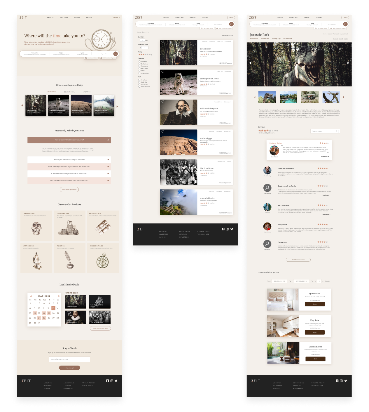
Where will the time take you to?
Zeit is a hypothetical subsidiary of Richard Branson’s Virgin empire. After a long struggle with Elon Musk, Virgin has been able to make time travel tourism available to all. My task was to create their new brand, and set up an ecommerce responsive website in which they can sell travel packages to different times.
Empathize
In the research phase, I conducted competitive analysis, user interview and card sorting research to learn about the market and target users. My main focus was to learn goals, needs and pain points of the user so I can start developing ideas for the solution to the problem that users face.
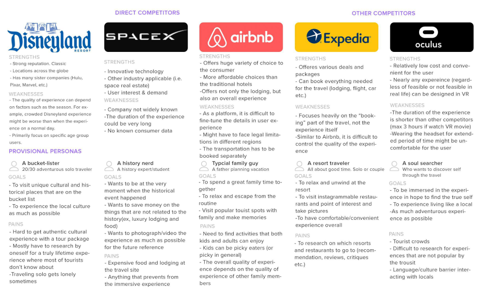
In the competitive analysis, I looked at direct/indirect competitors, user personas, how they approach to the problem, their strengths and weakness.
Couple examples of direct competitors are Disneyland, Space X and Airbnb - who offers unique experience as the main product.
In the user interview, I recruited total five participants in 20s and 30's who are interested in unique adventures. I asked a list of questions to find out their previous travel booking experience, motivations, goals, needs and pain points.
From the interview I found that
- ▶︎ Other people's opinion mattered a lot in terms of choosing a travel product
- ▶︎ Review from travelers with similar travel style and demographic is important
- ▶︎ Goal is to have a personal, unique experience at the best price for the value
- ▶︎ Pain point is to figure out logistics for the travel, as well as hidden cost and surprises.
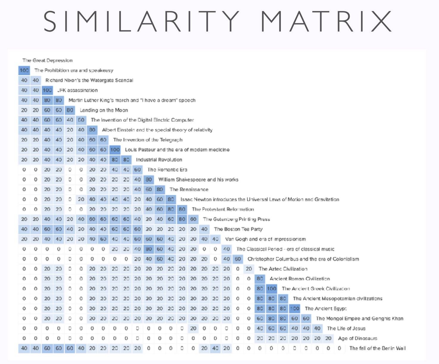
Next, Card sorting research was conducted to organize information hierarchy of the website.
Based on the result, six different prodduct categories were created to make navigation easier for users: Prehistoric, Civilizations, Renaissance, Art/Science, Politics and Modern Times.
Define
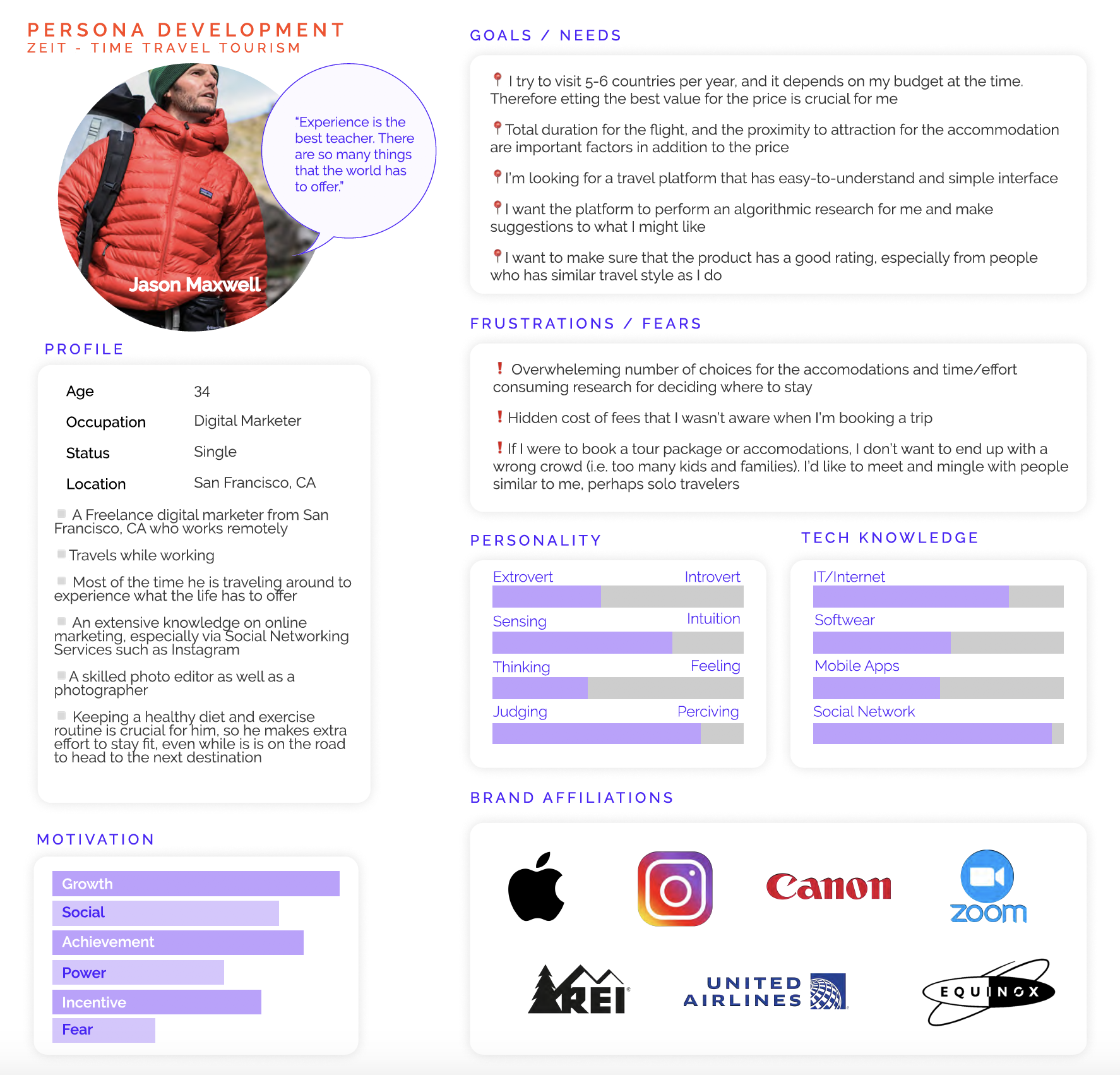
Based on the findings from the research, I created a user persona to define what a typical user would expect from using ZEIT's platform to book a trip.
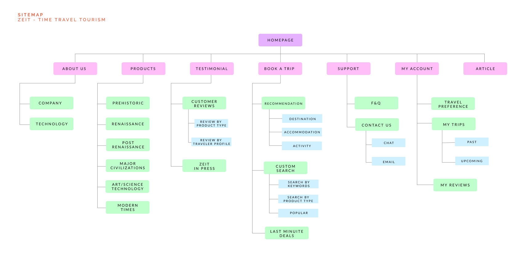
The site map was designed to organize hierarchy of information presented to users. Products were categorized into six different categories that were defined in the card sorting research.
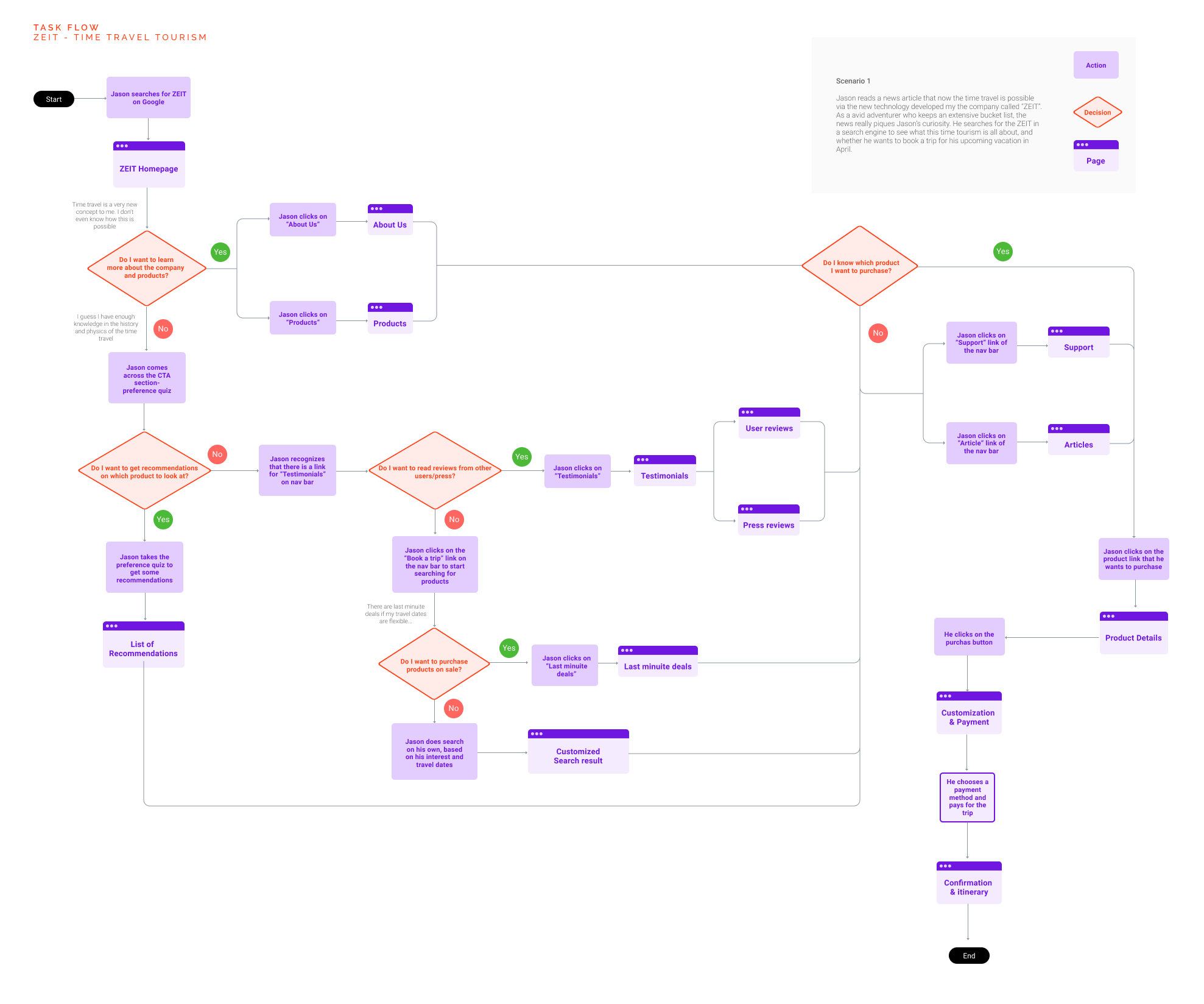
Then I've created the user flow diagram to illustrate a typical scenario where a user would book a trip on the platform.
Ideate
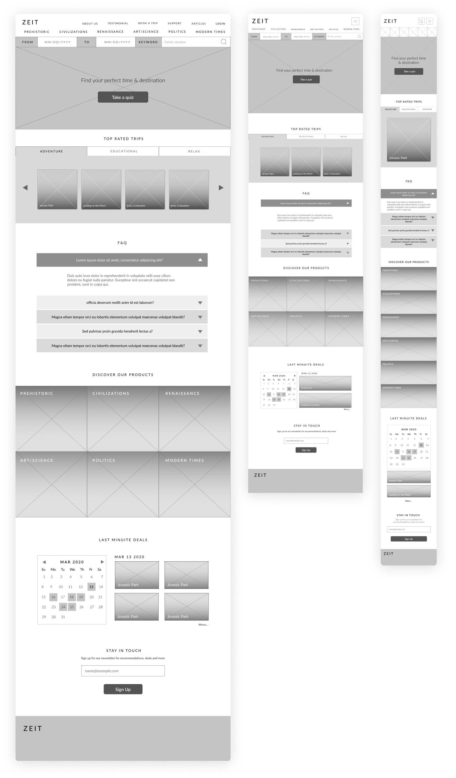
After researching which design patterns to use, I came up with wireframes to design the layout and visual hierarchy.
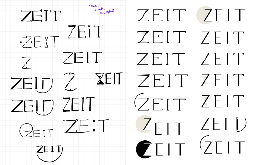
Next step was to design ZEIT's logo and brand identity that represent the company's mission and personality.
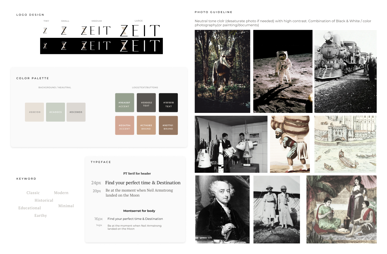
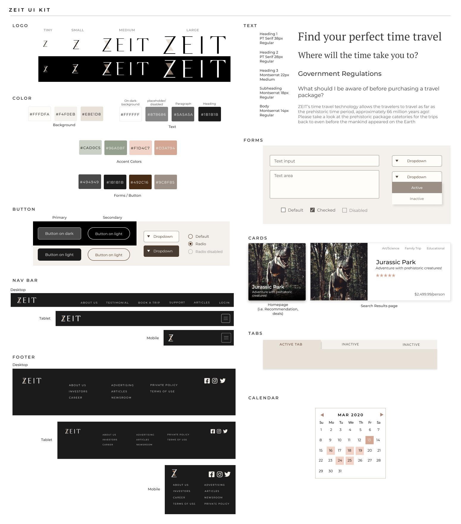
With the logo, brand colors and font, I designed different UI elements and put them together in the UI kit.
Prototype
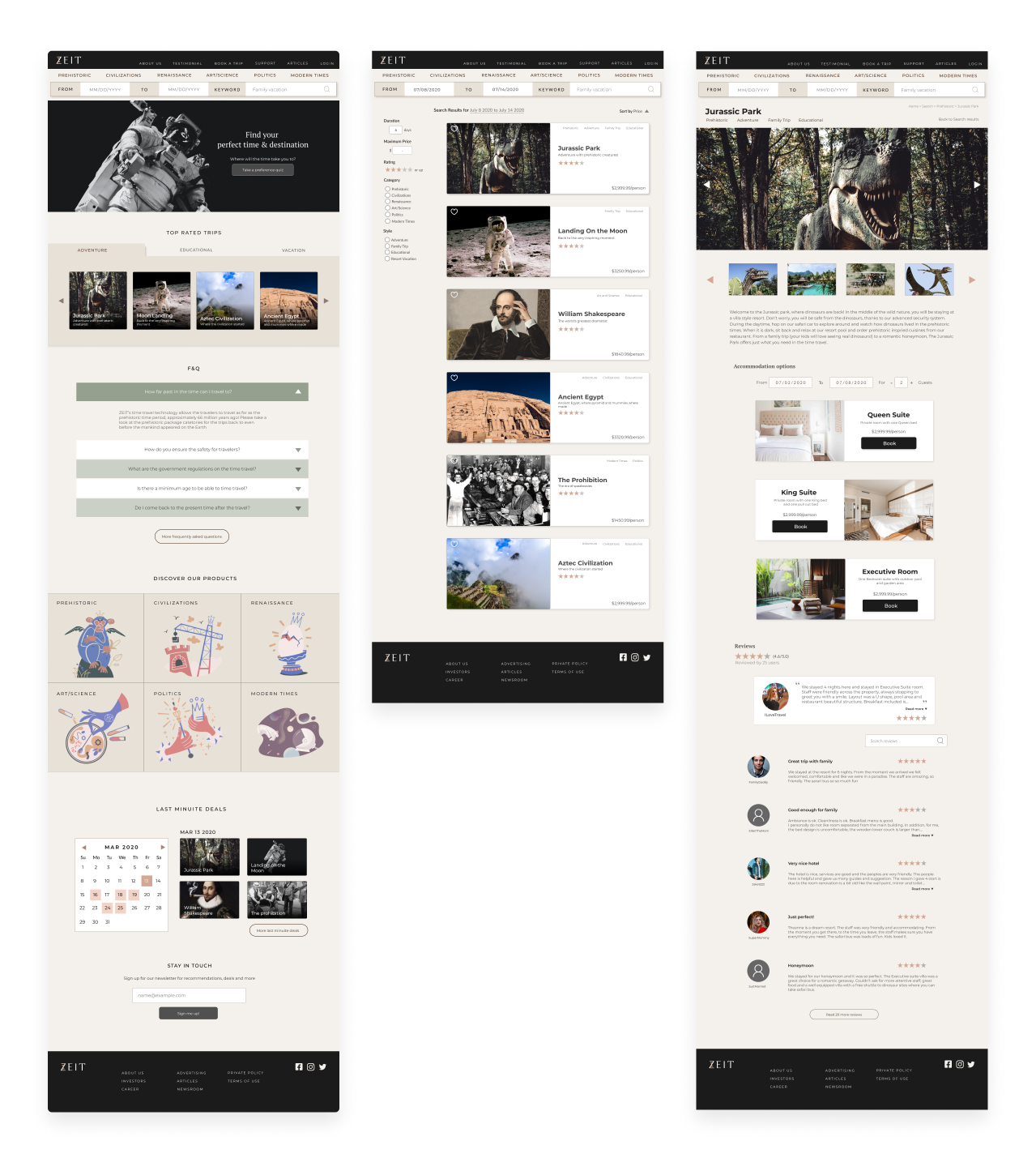
The first interactive prototype was created based on wireframes and UI kit.
Test
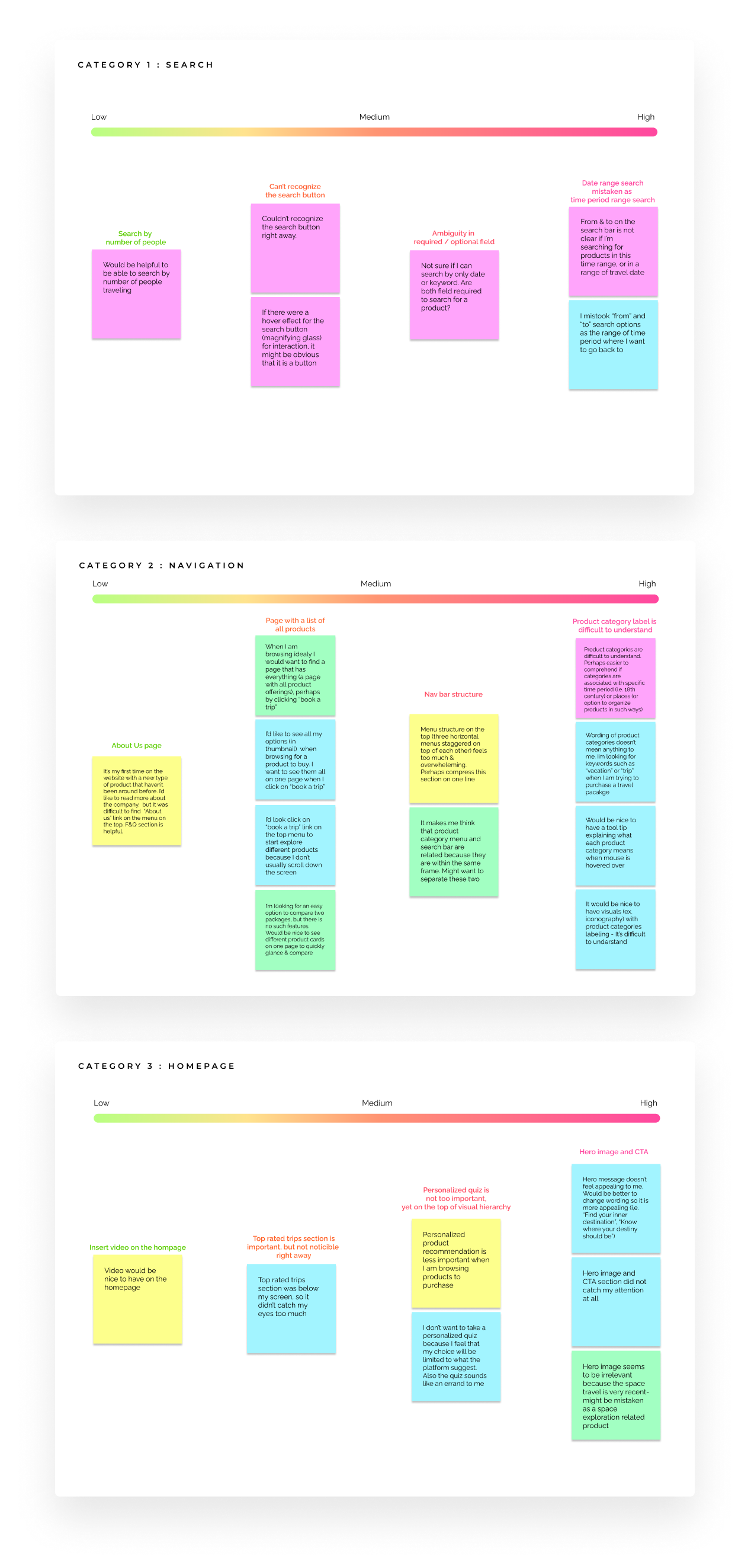
With the first prototype, I conducted usability testing sessions to test the overall ease of navigation and accomplishing key tasks, as well as to detect any potential issues. Using the notes from the testing sessions, I created an affinity map to categorize user feedbacks and prioritize which feedbacks need to be reflected in the next iteration.
Couple important insights gained from the testing:
- ▶︎ Users wanted to search products by time period (that they will be traveling) and location
- ▶︎ Product categories didn't make much sense to user group with little interest in the subject of history
- ▶︎ Need for a page where uers can browse through all products.
- ▶︎ CTA section did not grab user's attention
- ▶︎ Product detail page needed to focus more on the time travel experience rather than the accommodation list
- ▶︎ Need to highlight reviews from other travelers
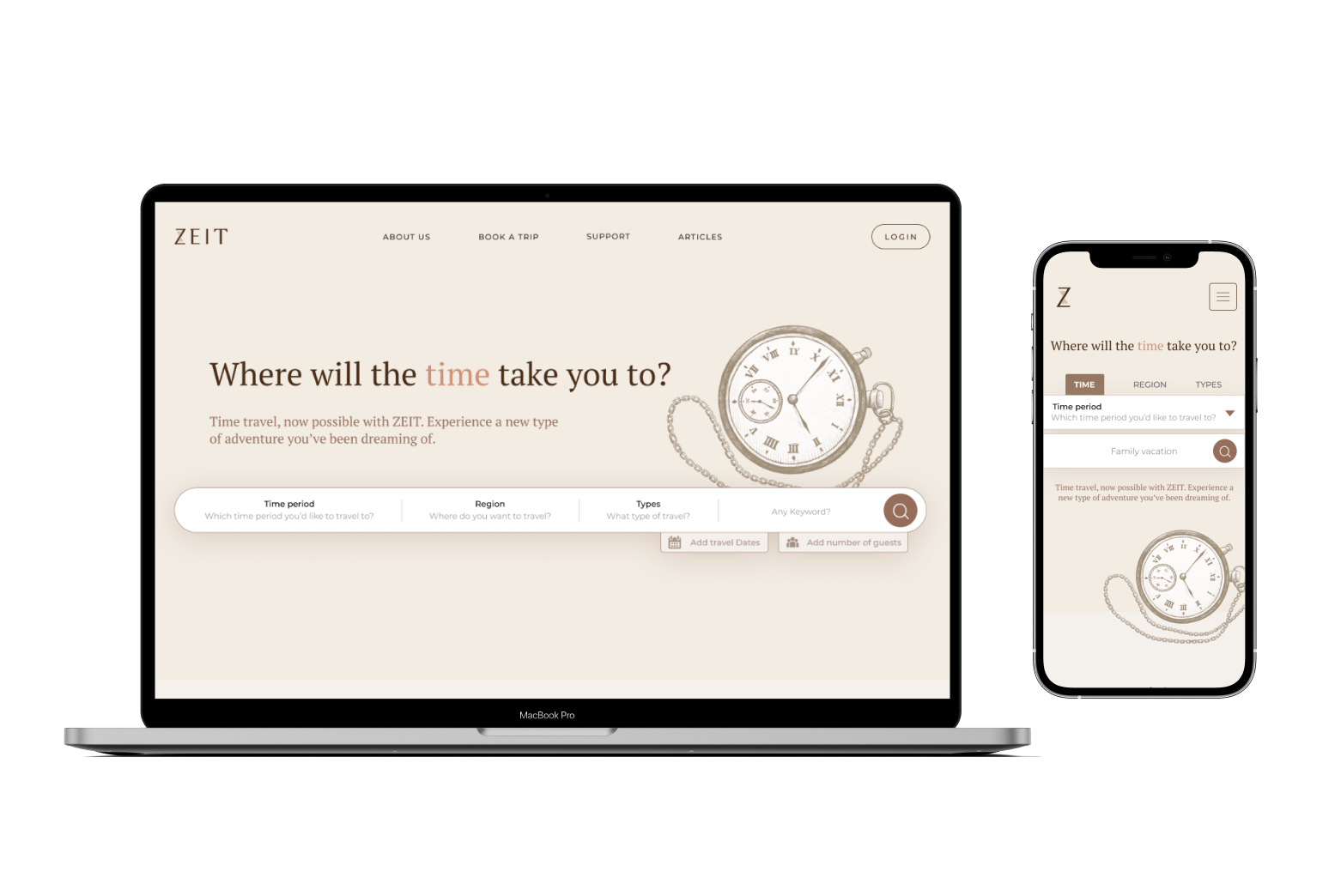
The prototype was revised to incorporate feedbacks from the usability testing session. → Link to the new & final prototype
